As a streamer, the aesthetic of your profile is likely designed from the perspective of a desktop, more specifically, on your laptop screen. However, the reality is that approximately 70% of your viewership is accessing your profile from the constraint of a mobile device screen. This discrepancy can lead to a mismatch between the quality of the user experience you envision and what your audience actually encounters, ultimately affecting your engagement and tip earnings. StreamerSuite’s mobile-friendly themes are designed to ensure that your profile maintains a sleek, legible and professional appearance across all devices, improving viewer engagement and promoting brand consistency.
Typically, streamers monitor their profile from the same device they use for streaming, which in most cases is a laptop or desktop with a broad display. From this perspective, the profile appears flawlessly organized and the graphics are exactly in place. Streamers therefore assume that their viewers are receiving the identical experience. Unfortunately, that is not the case.
The majority of your audience, around 70%, accesses your profile via a mobile device with a narrower screen, navigated by a single thumb. As such, the precise profile design meticulously crafted on your laptop can degenerate into a disorganized jumble when compressed to fit the small width of a mobile screen.
This oversight is a common error made by streamers when establishing their digital presence. Nonetheless, it’s a mistake that can be easily rectified once recognized and designed with a mobile-first approach in mind.
Mobile viewing has grown to become the dominant pattern in live streaming, often underestimated by streamers. In fact, data from most analytics platforms, including Chaturbate, indicate that about 70% of traffic originates from mobile devices. This implies that if you have a viewership of 100 people, 70 of them are accessing your profile from a phone or tablet.
There is a glaring disparity between the way streamers create their content and how viewers consume it. Most streamers, approximately 99%, utilize a laptop or desktop computer for streaming. This is understandable as these devices, equipped with larger screens and robust hardware, facilitate broadcast management. However, this preference also leads to a significant blind spot.
When you observe your profile on a broader screen, you see a completely different version compared to the majority of your audience. It is akin to designing a poster for a billboard display but eventually realizing that most people are viewing it on the size of a business card.
As a streamer, viewing your profile from a laptop gives you certain advantages. However, when the same layout is reduced to fit a mobile phone screen, a number of issues arise. From your vantage point on a laptop, these issues remain invisible. You see a neat, balanced design, but your mobile viewers may grapple with interpreting a page that appears disorganized and overwhelming.
Even if you do not personally browse streaming sites on your mobile, your audience’s habits should guide your design decisions. Mobile viewers are usually:
These factors require your mobile layout to deliver a clear and appealing impression immediately. A desktop profile that transforms into a jumbled mess on mobile devices could cost you followers, tips, and long-term fans.
Before making any changes to your profile design, it’s crucial to view it from your audience’s perspective. There are a few methods to accomplish this:
The findings from this exercise can be illuminating. It might reveal that graphics you found captivating are barely readable. It may also highlight that crucial buttons are too far down the page and text that appeared compact on your laptop now seems like an overwhelming block of words.
Developing a profile that performs uniformly well on both mobile and desktop platforms is more challenging than it appears. Streaming platforms were not initially designed with advanced responsive design in mind. They offer limited customization tools, making it difficult to strike a balance between visual appeal and usability across various devices.
Without a deliberate focus on mobile-first design, you are likely to end up with a profile that is visually appealing to you but frustrating for the majority of your visitors.
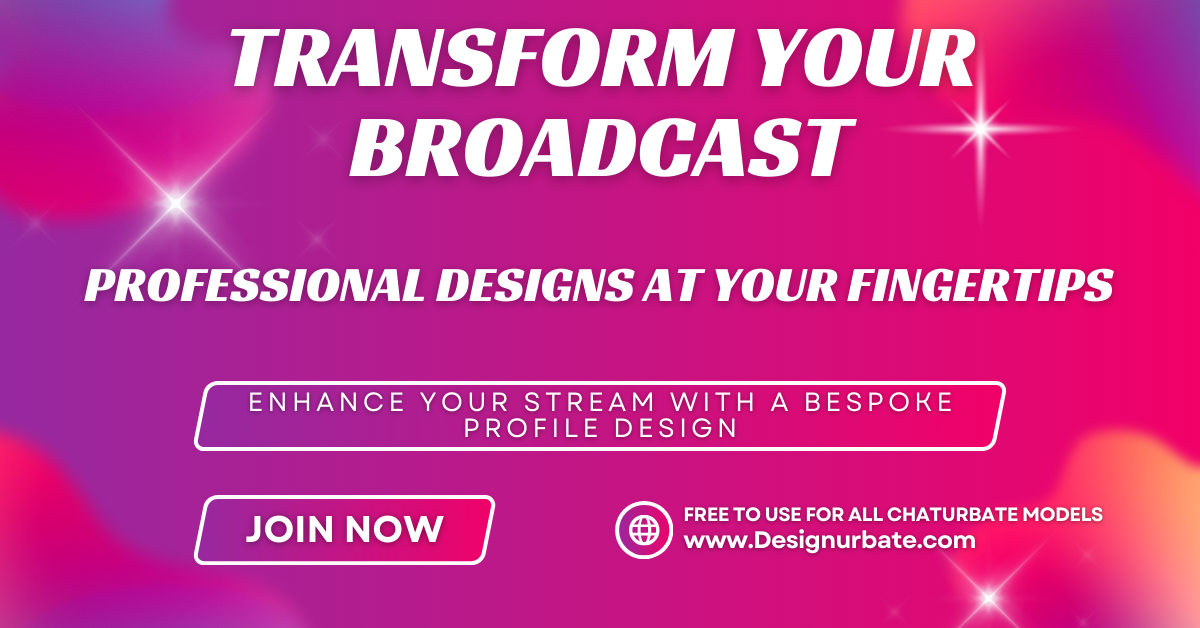
That’s where StreamerSuite’s profile design service comes into play. Every theme we create is fully responsive, meaning it automatically adapts to the size of the viewer’s screen. Regardless of whether someone is viewing your profile on a widescreen desktop monitor, a laptop, a tablet, or a small phone, the layout is optimized for clarity and impact.
By adopting a mobile-first design approach, we ensure:
By utilizing a StreamerSuite theme, you receive a design that is not just visually appealing on your own laptop but also one that caters to the 70% of your audience who visit from a phone. This can directly influence your engagement, tips, and overall fan growth.
Our mobile-optimized profile designs clearly demonstrate how our themes tackle this challenge. Comparing these to your current layouts, the difference will be evident.
A mobile-optimized profile does more than just look tidy. It changes how people interact with your content:
Even minor improvements in mobile usability can result in measurable increases in engagement and revenue.
To maintain an appealing profile on mobile, here are a few errors to avoid:
StreamerSuite’s themes are created to automatically evade these pitfalls, but if you are customizing your own profile, these are points to bear in mind.
A mobile-friendly design is not a one-time setup but requires regular updates. Platform layouts change, new content is added, and your audience’s device preferences can shift over time. It’s advisable to:
Consider your profile as a dynamic aspect of your brand that needs regular maintenance.
If you are a streamer who has been designing your profile mostly from a laptop or desktop perspective, it’s time to adjust your approach. The majority of your audience is viewing an entirely different version than what you are.
Adopting a mobile-first design approach is not just an additional advantage. It is crucial if you aim to connect with the 70% of viewers who browse from their phones. Without this, you risk losing potential fans simply because your profile is challenging to navigate on the devices they use most frequently.
With StreamerSuite’s mobile-optimized themes, you can be confident that your profile will appear impressive and function flawlessly on both mobile and desktop. This allows you to concentrate on streaming while ensuring your brand leaves a positive impression each time someone visits.
While your laptop might be your creation hub, your mobile viewers are where you expand. Ensure your profile acknowledges them as the priority they truly are.
For those looking to dive deeper into these strategies, this comprehensive streaming optimization guide provides additional insights and practical techniques that complement what we’ve discussed here.